Create long time statistics from Home Assistant data
This article is for you, if:
- you want to visualise Home Assistant statistics over a longer period than the dashboard allows
- you want to know more about how the database of Home Assistant works generally
You'll learn the following:
- How the default database of Home Assistant works
- How to connect to the database and run simple queries
- Use a little more complex SQL to generate daily data
- How to generate a chart using a free, open-source tool
If you want to skip the basics you can jump to Querying and exporting data.
Home Assistant database
If you did not change any settings, Home Assistant uses an SQLite database, stored in your configuration directory.
There are a few tables which Home Assistant uses to record all things that happened in your smart home. Because it is using an event driven approach you can basically see everything that has happened since you first installed Home Assistant.
Connecting to the database
To follow the next steps you need to have SSH access to the machine running Home Assistant.
I'm using TablePlus for Mac to connect to the database. If you are on Windows a popular alternativ is HeidiSQL, which also supports SQLite.
To connect to the database, create a connection that looks like the following:
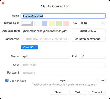
The important bits are:
Over SSH: you will connect the database using an SSH tunnel. This means that TablePlus will first connect to the machine with SSH before connecting to the database itself.
Database path: Enter the absolute path to the database file which is used by Home Assistant. Most likely this will be a path like this:
/home/pi/path-to-configuration-folder-of-home-assistant/home-assistant_v2.db
Click on "Test" to make sure you've filled out everything correctly and click "Connect" to drop into the database.
Understanding the structure
Compared to many other systems, Home Assistant doesn't have that many tables to provide all the features it does.
In part, this comes from a good database architecture, but also from making use of JSON fields to store additional data, which would otherwise need many additional fields in the tables.
These are the tables Home Assistant uses, as of version 2022.6.4.
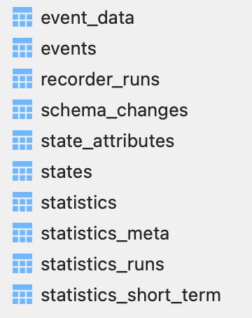
I won't explain every table, we'll focus on States, Events and Statistics.
events and event_data
Events are things that can happen in your Home Assistant installation. This includes system things like the loading of a component or when an automation was triggered. The events table only includes metadata like the event type, when the event was triggered and a few more fields. But most importantly it includes a foreign key data_id which references the event_data table.
The event_data uses a JSON field which contains all data the event contained. If, for example, you turn a light on from the dashboard, behind the scenes a call_service event is fired. The event data contains data like this:
{ "domain": "light", "service": "turn_on", "service_data": { "entity_id": "light.nightdesk", "brightness_pct": 55 }}states and state_attributes
While events not necessarily need to have a relation to a specific entity, states do. States describe the concrete state an entity can have, like how bright your light is.
Like with events the states table contains metadata and state_attributes more details about the state which was changed.
statistics
This table contains statistical data about sensors. It references the specific sensor ID with the foreign key metadata_id. If you take a look into statistics_meta you'll can find the numeric ID for your specific sensor. You'll need this in the next step.
Querying and exporting data
Now lets assume we want to get all statistics about a speficic sensor. This is the query we would write:
SELECT *FROM "statistics"WHERE "metadata_id" = idORDER BY "id"Make sure to replace id with the correct ID of the sensor you want to query.
Since the statistics platform writes to this table every hour, depending on the age of your sensor, you will get a lot of rows back. My sensor is about 2 months old, which resulted in 1.600 rows of data. Since I wanted to visualize how a sensors internal battery declined over the period of multiple weeks one data point per day will be enough:
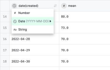
SELECT date(created), mean/* using the date function we can strip the time from the created field */FROM "statistics"WHERE "metadata_id" = idGROUP BY date(created)/* also grouping by only the date ensures only one row per day */ORDER BY "id"The result should look like this:

Next, export the data as a csv file.
Visualising data with RAWGraphs
RAWGraphs is a great online tool to quickly visualise data.
After uploading your recently created csv file, RAWGraphs gives you a lot of options for correctly parsing your data. It is pretty smart about finding the correct settings for you. If you want to visualise data over periods of time make sure to format the date column as date:
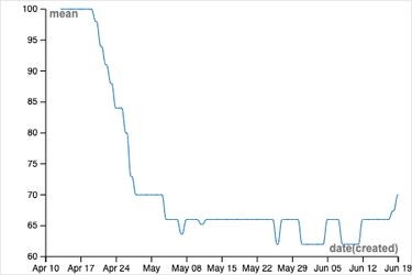
In the next step, you have to choose a chart type. For the purpose of visualising the decline of a battery I chose the line chart.
Now you need to define the dimension mapping. Drag the date column into the x-axis and the mean column into the y-axis:

With these settings, you should now get an auto-generated chart like this:
I hope this post helped you! If you have any questions, hit me up on X 😊.
You might find these related articles helpful or interesting, make sure to check them out!